

The logotype, drawn in the run-up to the IPO. All caps, the letters lifting as they go, one exclamation point doing the work of a symbol. Still legible at favicon size three decades on.
A brand and motion studio for companies in television, technology and the places between. We draw the mark, write the standards that keep it alive, cut the film, and art-direct the room it plays in.
Colour bumpers · with Christopher Wargin ↗ · forty in the showcase ↗
Most studios hand off at the logo. We stay through the thread colours, the vinyl spec, the minimum size on a favicon, the edit, the grade and the run of show. The reason is simple: a mark that has never been tested at sixteen pixels or on a sixty-foot LED wall is not finished.
Logos, wordmarks and the design system behind them — colour in Pantone, CMYK, RGB, thread and vinyl; clear space; minimum size; embroidery digitising; the misuse page nobody else writes.
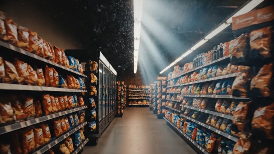
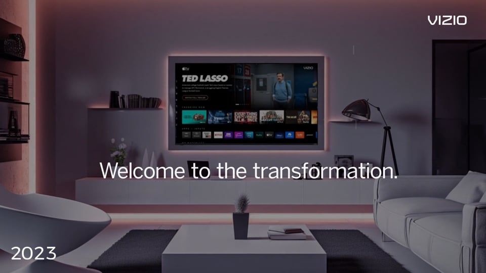
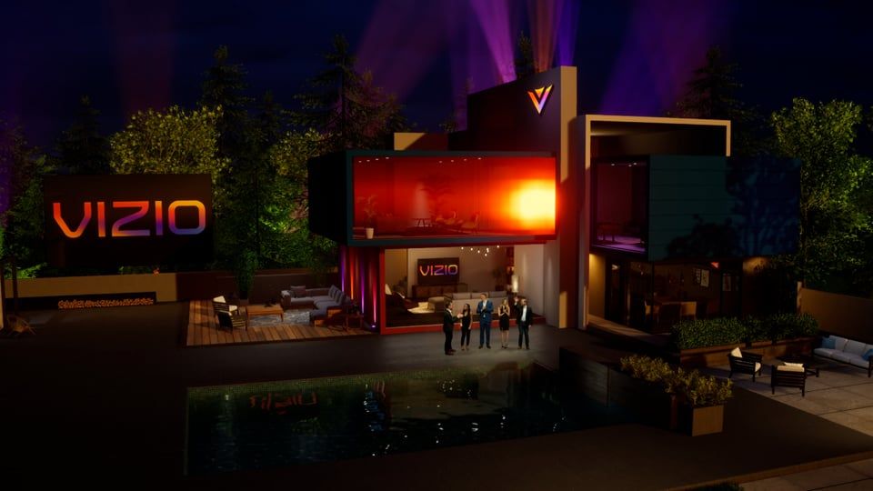
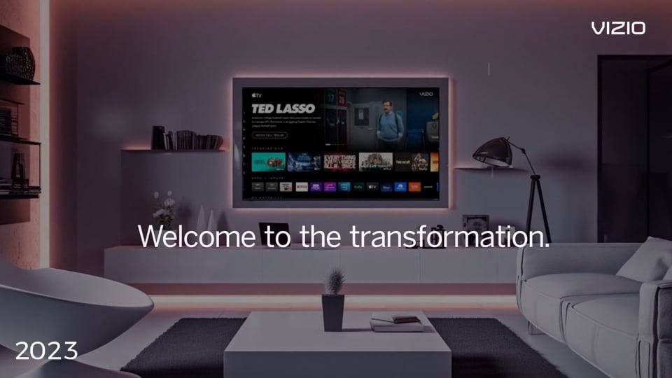
Opening films, sizzles, product stories and stage transitions. Concept, direction, edit, motion graphics and grade in house. Real-time and virtual production when the shot calls for it.
Interface and product design for television, streaming and advertising systems — drawn from inside TiVo, DIRECTV, Fox and Disney rather than read about second-hand.
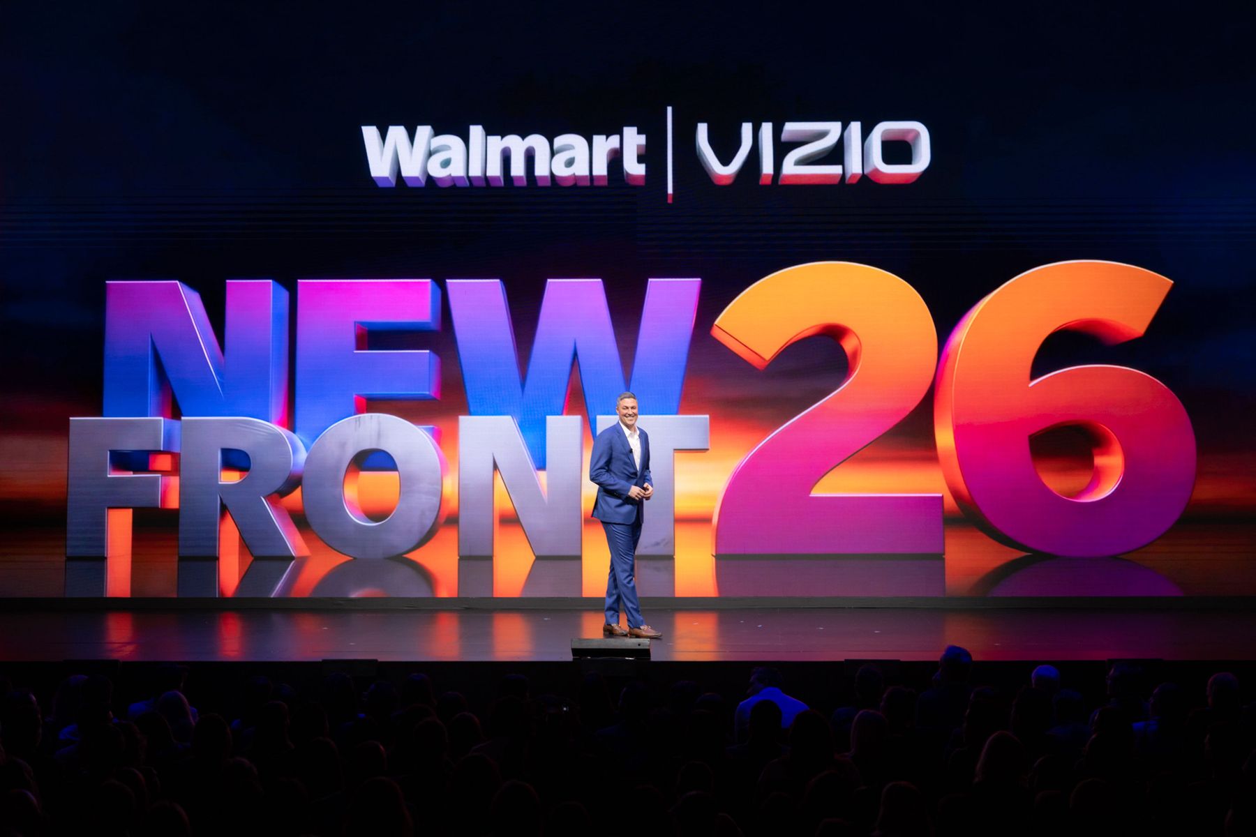
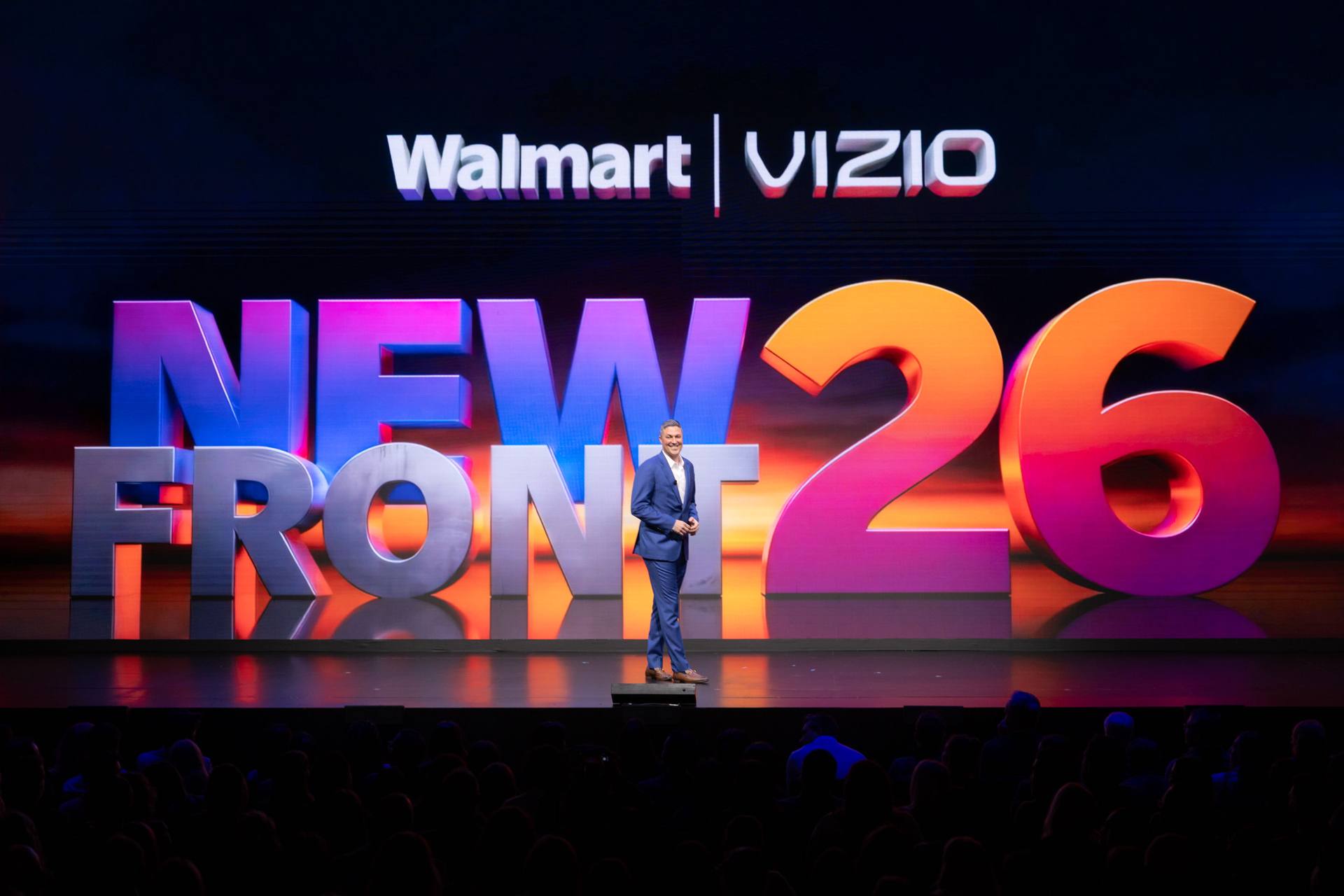
Creative direction for upfronts and NewFronts: stage and screen design, content packages, printed programme, signage and the visual logic that holds a two-hour show together.
One ink, one weight, so they read against each other rather than their own brand colours. Made with the people named beneath them.
The logotype, drawn in the run-up to the IPO. All caps, the letters lifting as they go, one exclamation point doing the work of a symbol. Still legible at favicon size three decades on.
Drawn as TheDJ.com became Spinner — the first internet music service, and a wordmark sitting inside its own broadcast. Acquired by AOL the following year.
Seven bars — a frame’s worth of television pixels, one moment sampled and tagged. The company’s whole product in a mark. Acquired by Comcast.
Title identity for a live trivia format, built to hold up on a phone held one-handed and on an ad-sales stage the same week. One word, two weights, no second element to lose.
The startup’s founding wordmark. LOOP knocked out of a stadium shape, so the second half of the name draws the idea. Built to animate from the outset.
Monogram, lockup and chart style guide for the human-centric research platform — a system built to survive being pasted into a client’s deck.
A television that is also a frame, drawn with one corner rounded away so the set reads at banner size and at avatar size without redrawing.
A monogram that is also a waveform: the M drawn as a signal crossing a frame, set against a slab serif heavy enough to hold a masthead.
The publication’s mark, stamped on every title card. Not an asset — it is drawn in type and sized to its container, so one mark serves a thumbnail and a share image without a swap.
Each plays a silent loop. Click one to open it on Vimeo; the rest of the archive lives there.
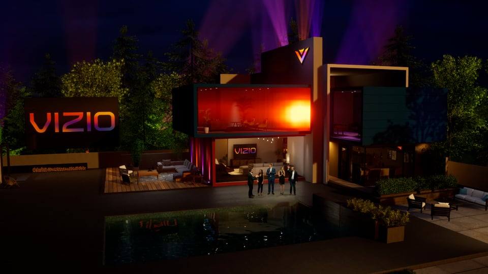
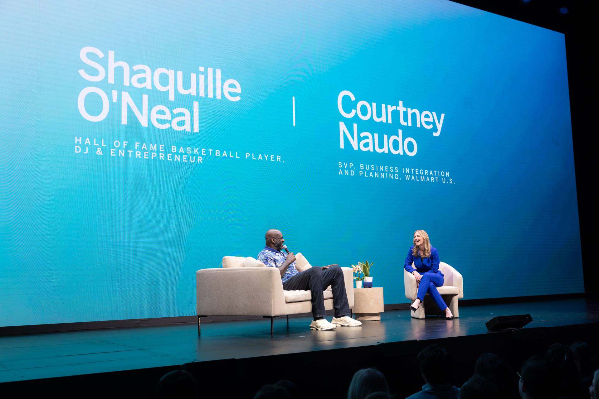
Creative direction across the whole surface of the show: the title system on a wall wide enough to seat the audience under it, the screen content between segments, and the printed programme in the hand. One identity, three very different reproductions — which is the entire argument for standards.
A small studio: one principal, and a short list of people it works with. What sits behind it is a career spent inside the networks and platforms — TiVo, DIRECTV, Fox, Disney — running the organisations that commission work like this.
We ran the product and advertising organisations inside networks and platforms. We know what a brief costs to execute, because we used to be the one paying for it.
The person in the pitch is the person doing the work. Sessions are on Zoom and recorded; every draft gets a written review between sessions.
Ours include a worked example of every deliverable — the colour page, the embroidery version, the misuse page — so you can see where it lands before choosing a firm.
Marks still in service, an Emmy peer-group governorship, and an ad business taken from launch to scale. Full background and credits →
Most engagements start with a short call and a written brief read back to you. Two-week sprints are normal; so are design systems that outlast the people who commissioned them.