 Paused2:00
Color bumpers · with Christopher Wargin ↗ · forty in the showcase ↗
stardust+gravity
A product marketing, design and production studio.
Identity systems that hold up after handoff. Film cut and graded in house. Publications running daily on systems we built. Stage and screen for upfronts and NewFronts.
Learn moreFeatured
Paused2:00 Paused1:25
 Paused0:39
 Paused0:24
 Paused1:12
 Paused1:17
 Paused3:26
 Paused3:56
Color bumpers · with Christopher Wargin ↗ · forty in the showcase ↗
- Document
- Selected work
- Practice
- Product marketing, identity, publishing, film, live events
- Principal
- Geoff Katz, Creative Director
- Enquiries
- geoff@stardustgravity.com
Stardust + Gravity · Selected work01 · Practice
01 · Practice
What the studio does, all the way through.
Most studios hand off at the logo. We stay through the thread colors, the vinyl spec, the minimum size on a favicon, the edit, the grade and the run of show. The reason is simple: a mark that has never been tested at sixteen pixels or on a sixty-foot LED wall is not finished.
I.
Product marketing
Positioning, naming and the category story — launch narrative, sales enablement, and the go-to-market deck that has to survive a room of buyers.
II.
Identity & standards
Logos, wordmarks and the design system behind them — color in Pantone, CMYK, RGB, thread and vinyl; clear space; minimum size; embroidery digitising; the misuse page nobody else writes.
III.
Film & post
Opening films, sizzles, product stories and stage transitions. Concept, direction, edit, motion graphics and grade in house. Real-time and virtual production when the shot calls for it.
IV.
Experience & product
Interface and product design for television, streaming and advertising systems — drawn from inside TiVo, DIRECTV, Fox and Disney rather than read about second-hand.
V.
Live events
Creative direction for upfronts and NewFronts: stage and screen design, content packages, printed program, signage and the visual logic that holds a two-hour show together.
Stardust + Gravity · Selected work02 · Selected marks
02 · Marks
Marks drawn to outlast their briefs.
One ink, one weight, so they read against each other rather than their own brand colors. Made with the people named beneath them.
Yahoo!
The logotype, drawn in the run-up to the IPO. All caps, the letters lifting as they go, one exclamation point doing the work of a symbol. Still legible at favicon size three decades on.
At Organic Online, with Kevin Farnham ↗
Spinner
Drawn as TheDJ.com became Spinner — the first internet music service, and a wordmark sitting inside its own broadcast. Acquired by AOL the following year.
Watchwith
Seven bars — a frame’s worth of television pixels, one moment sampled and tagged. The company’s whole product in a mark. Acquired by Comcast.
With Emotive Brand ↗
FN Genius
Title identity for a live trivia format, built to hold up on a phone held one-handed and on an ad-sales stage the same week. One word, two weights, no second element to lose.
In-house at Fox Networks Group
Game Loop
The startup’s founding wordmark. LOOP knocked out of a stadium shape, so the second half of the name draws the idea. Built to animate from the outset.
For Zane Vella, Game Loop ↗ · with Mackenzie Katz ↗
PlayWorks
Jonathan Boltax’s connected-TV games company: game apps and FAST channels built around YouTube creators, launched across 200 million connected devices. PLAY is knocked out of the square so the mark holds as a solid at app-tile size; the dot in .WORKS is the same red, so it can stand alone.
With Trollbäck+Company ↗
CIMM
The 2023 redraw for the Coalition for Innovative Media Measurement: the same four letters as one continuous rounded stroke, with the dot of the i set free, so the name holds on a summit wall and as a favicon. In use across the coalition’s site, events and decks since 2024.
Through Fabric Media ↗
TVREV
A television that is also a frame, drawn with one corner rounded away so the set reads at banner size and at avatar size without redrawing.
Stardust + Gravity
The Measure
A monogram that is also a waveform: the M drawn as a signal crossing a frame, set against a slab serif heavy enough to hold a masthead.
Stardust + Gravity
medianexis.
medianexis.
Two weights of one face and a period doing the work of a symbol. Set in the same Archivo the site is built in, so the wordmark, the headlines and the category plates are one voice — and on the site the period carries the only color.
Stardust + Gravity
Stardust + Gravity · Selected work03 · Publications
03 · Publications
Publications, out every day.
A masthead is the hardest test a mark ever gets. It has to hold the top of the page while everything underneath it changes, every day, with nobody from the studio in the room. So we draw the mark and then build the thing it has to survive: the templates, the type scale, the category plates, the rules that let an editor file at seven in the morning without breaking the page. All three of these appear again as marks below.
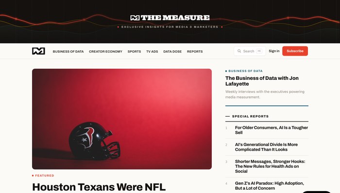
Exclusive insights for media and marketers. The waveform beneath the masthead is the publication’s only ornament, and it has to hold from a full-bleed header down to a favicon.
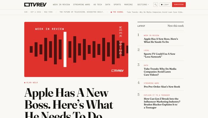
The future of television, dissected daily. An editorial serif at display size over a monospaced deck line, with the week’s signal pinned above the fold and a ranked index down the right.
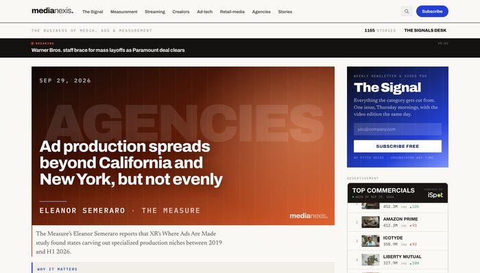
The business of media, ads and measurement, built to be cited. Each story sits on a dated plate with its category ghosted behind the headline, so the front page never waits on a photograph; The Signal and the Wire run down the right.
Stardust + Gravity · Selected work04 · Live
04 · Live
Walmart × VIZIO NewFront, March 2026.
Creative direction across the whole surface of the show: the title system on a wall wide enough to seat the audience under it, the screen content between segments, and the printed program in the hand. One identity, three very different reproductions — which is the entire argument for standards.


Creative direction with Fabric Media ↗ and Julian Sarimento ↗ and Casey Stockdon ↗ · Event photography, Guy Piaquadio
Stardust + Gravity · Selected work05 · Studio
05 · Studio
Fewer people, further through.
A small studio: one principal, Geoff Katz, and a short list of people it works with. What sits behind it is a career spent inside the networks and platforms — TiVo, DIRECTV, Fox, Disney — running the organizations that commission work like this.
I.
We have been the client
We ran the product and advertising organizations inside networks and platforms. We know what a brief costs to execute, because we used to be the one paying for it.
II.
One principal, no handoff
The person in the pitch is the person doing the work. Sessions are on Google Meet and recorded; every draft gets a written review between sessions.
III.
Proposals show the destination
Ours include a worked example of every deliverable — the color page, the embroidery version, the misuse page — so you can see where it lands before choosing a firm.
IV.
Receipts
Marks still in service, an Emmy peer-group governorship, and an ad business taken from launch to scale. About the studio → · Full background and credits →
Stardust + Gravity · Selected work06 · Editions
06 · Editions
Editions, printed and numbered.
Original art out of the studio, published as Stardust Gravity Editions. Each sheet takes held source material — Apollo-era photography, television frames, roadside Americana — and runs it back through a printing process until the process itself becomes the subject. Prices on request.
Sheet 002 · Retroactive 2026
June 2026 · Rev. CFive two-color studies held as continuous tone, with no halftone anywhere. Each is built from two screens: one carries the photographic image, the other a flat color field and its off-register ghost. Ten separated plates in all.
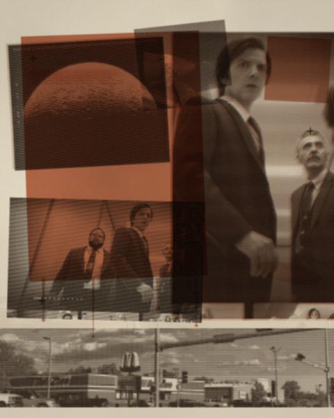
Warm black + oxblood
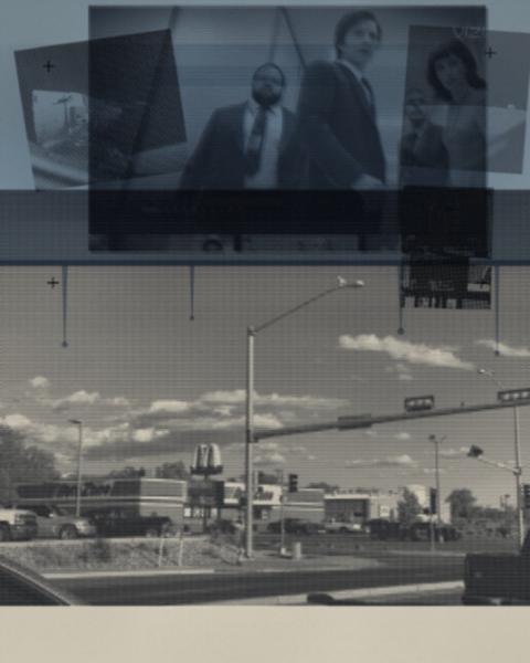
Cool black + cobalt
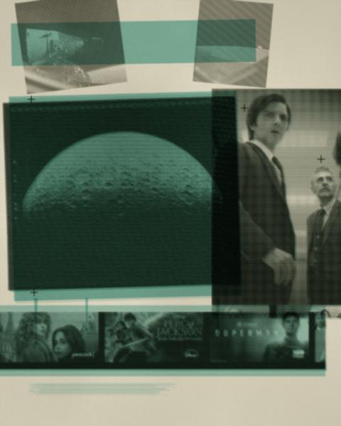
Cool black + turquoise
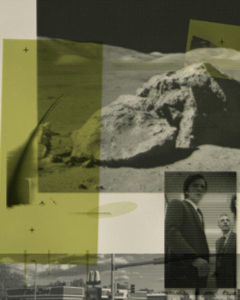
Cool black + chartreuse
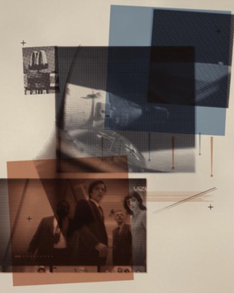
Cobalt + oxblood
- Studies
- Five, two inks each
- Screen
- Continuous tone, no halftone
- Plates
- Ten, separated
- Format
- 4:5 · 1200 × 1500
Sheet 003 · reality.exe
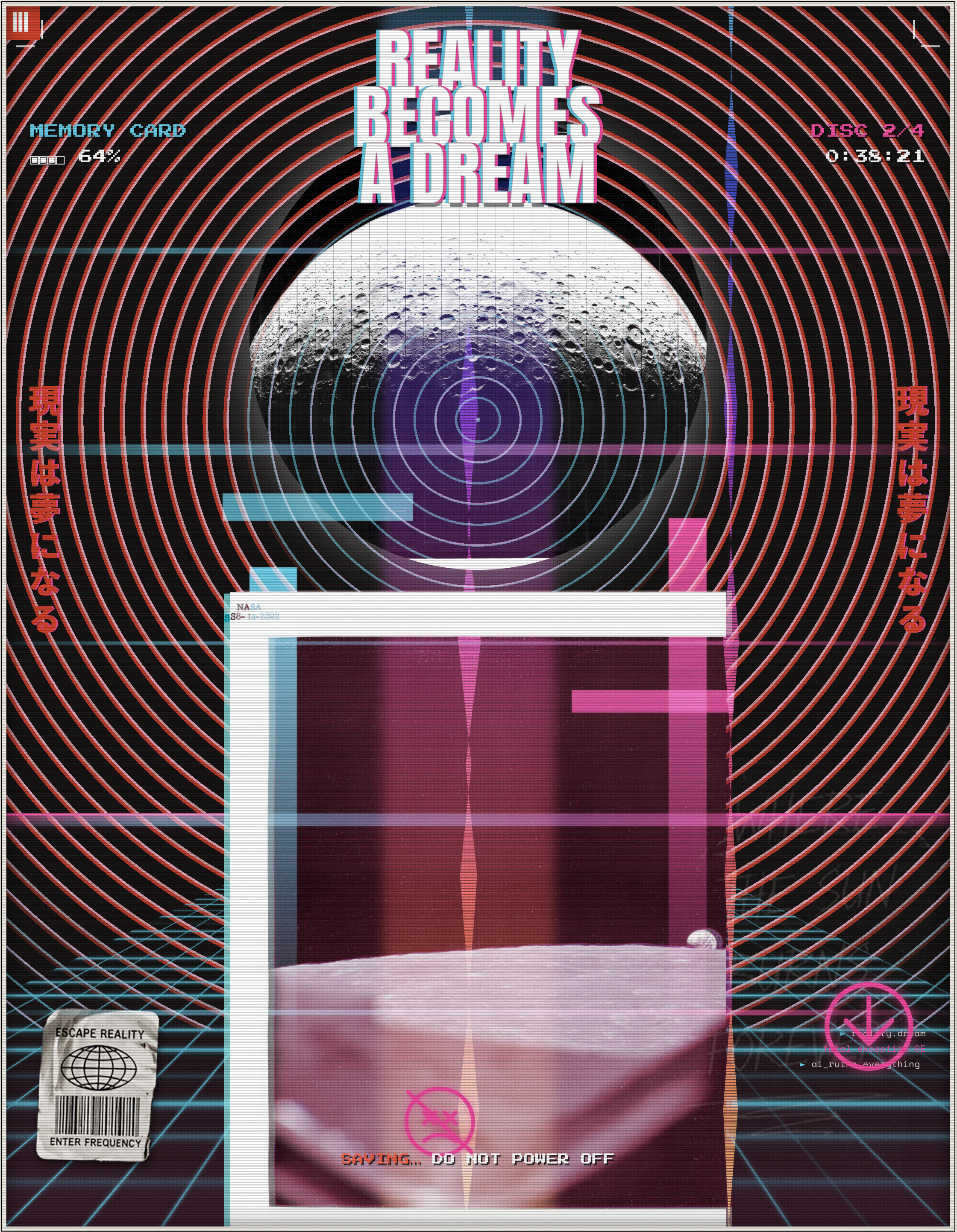
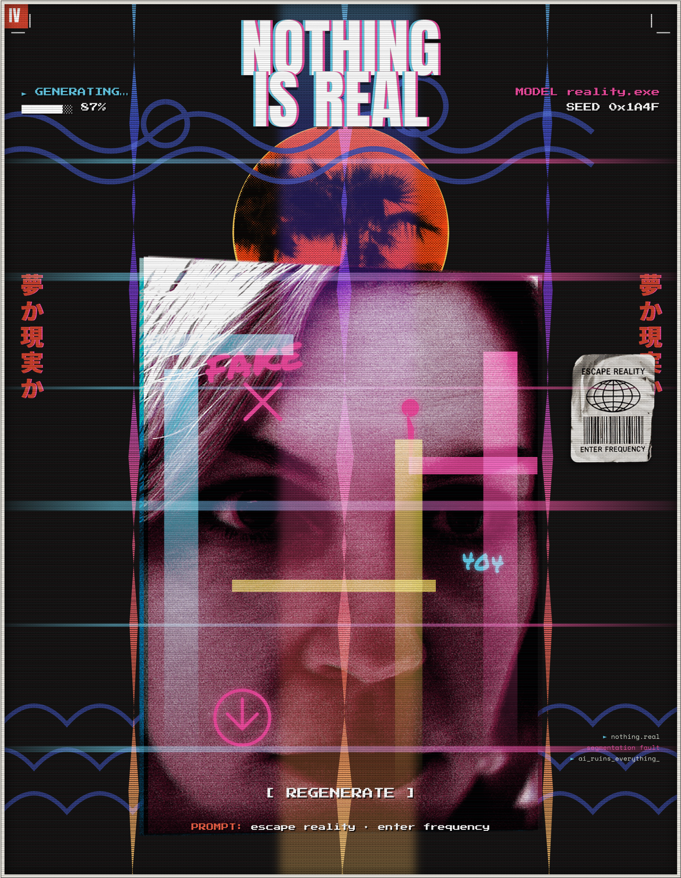
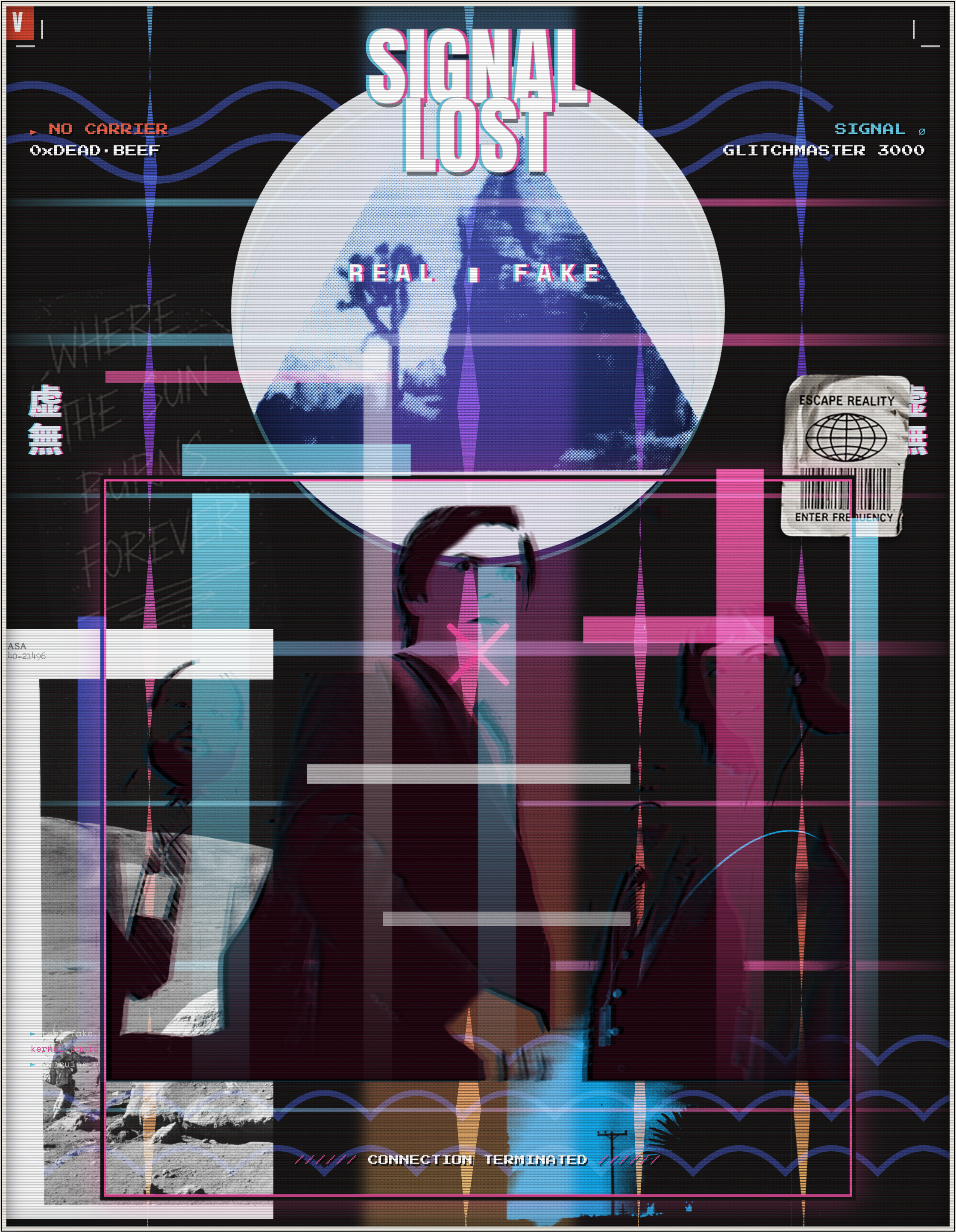
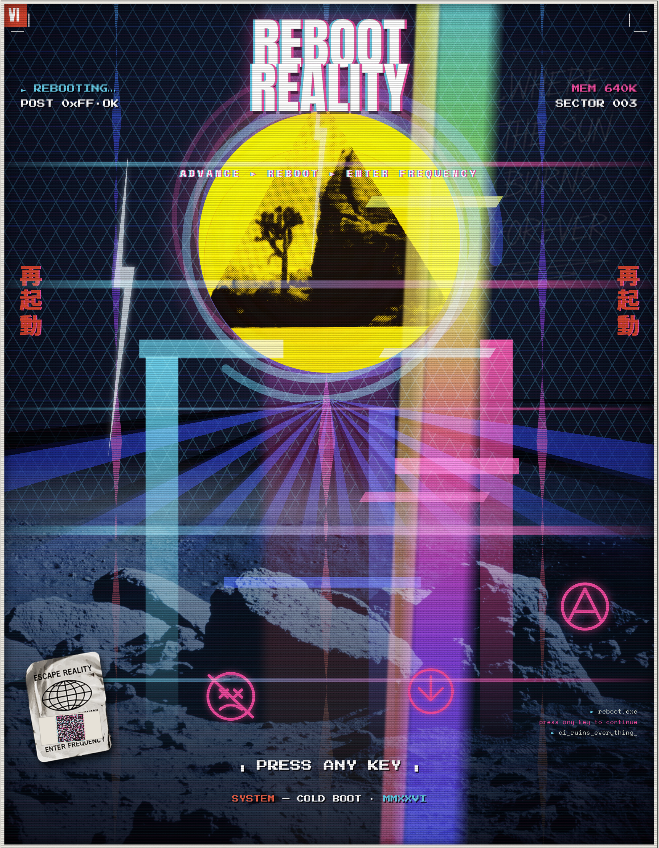
MMXXVI · Third artist’s proofSix glitch reductions from the same held sources, run back through a corrupted screen — halftoned, mis-registered, dragged into the feed: the propaganda poster after the machine got in.
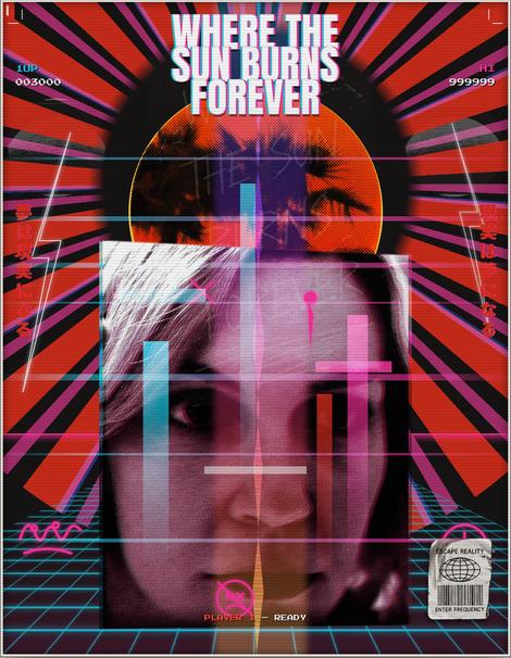
reality.exe
Download ↓
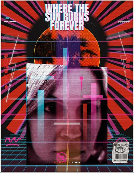
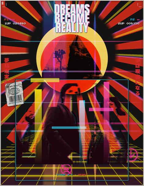
dreams.exe
Download ↓
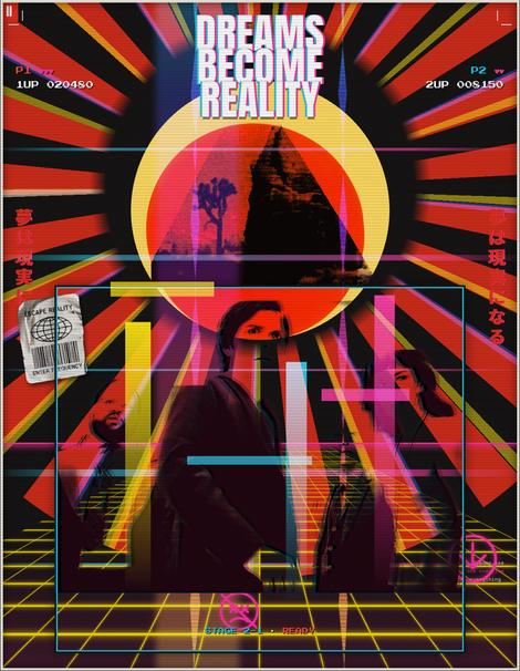
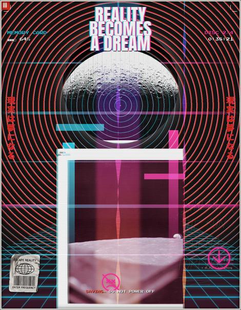
reality.dream
Download ↓
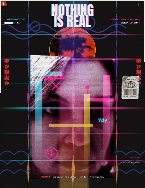
nothing.real
Download ↓
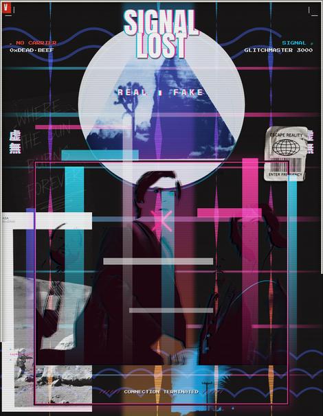
signal.lost
Download ↓
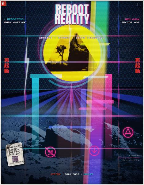
reboot.exe
Download ↓
- Edition
- 30, with 8 A/P each
- Stock
- Bright white card, 290
- Process
- Four-color CMYK, one fluoro hit
- Screen angles
- C 15° · M 75° · Y 0° · K 45°
Prices on request · geoff@stardustgravity.com · Sheet 002 ↗ · Sheet 003 ↗
Stardust + Gravity · Selected work07 · Contact
07 · Contact
Tell us what has to hold up, and where.
Most engagements start with a short call and a written brief read back to you. Two-week sprints are normal; so are design systems that outlast the people who commissioned them.
- Telephone
- 310.770.8312
- Archive
- vimeo.com/stardustgravity ↗